Be inspired by French contrasted symbols
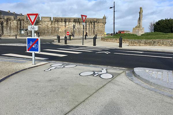
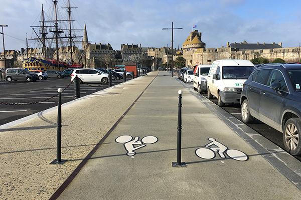
The French city of Saint-Malo has refurbished the roads with contrasted PREMARK™ bicycle symbols that blends in with the historic surroundings and increases the safety of vulnerable road users.
Situated in Brittany on the English Channel, Saint-Malo is a city with a distinct historic look and feel. When the city initiated a road renovation project last year, they therefore preferred a solution to match the surroundings - and luckily, we were able to assist by providing markings to fit the purpose.
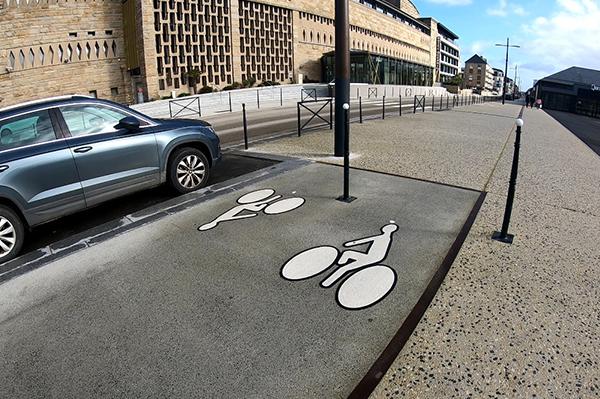
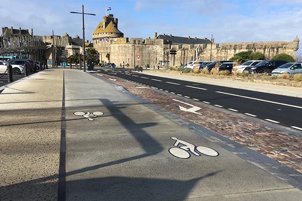
The renovation was centered around “Palais du Grand Large”, which is the city congress center. The bicycle lanes in this area are made of concrete and used to be decorated with white bicycle symbols on a black square background. However, after seeing the micromobility options offered by Geveko Markings, the city chose to go with white symbols surrounded by a black line instead. These ‘contrasted’ PREMARK™ symbols, ensures a better visual integration with the rest of the historic surroundings while still being perfectly visible on the light surface. The fact that the contrasted markings are produced with the EasySystem is a real advantage when it comes to application process as the different parts of the design are held together with an adhesive layer.
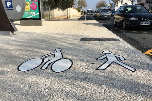
More recently, the city of La Rochelle has also followed suit and applied contrasted symbols as part of their micromobility applications.
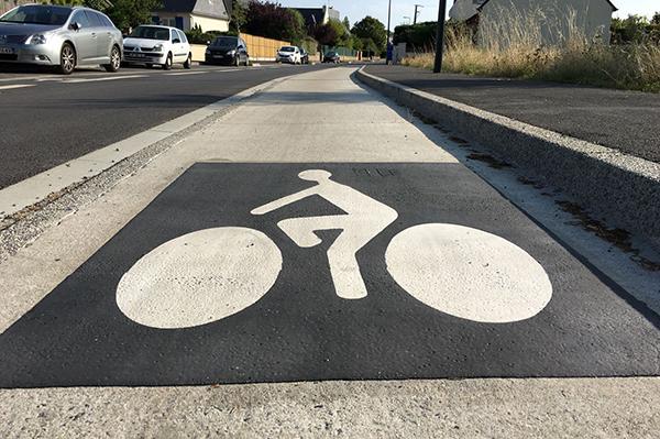
Saint-Malo was not the first to install this type of markings, however. First to adopt the contrasted PREMARK symbols in France were Toulouse Métropole. Back in 2019, the city was looking for a solution to ensure that white preformed symbols were perfectly visible - even on lighter surfaces such as deactivated concrete or shot-blasted asphalt. As you might have guessed, the solution they landed on was the contrasted symbols.
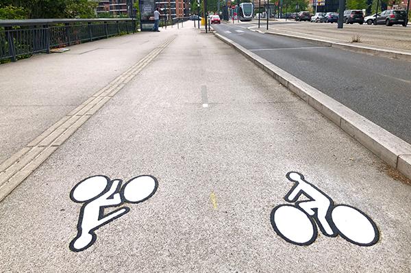
A prototype was first applied on the Saint Michel Bridge in Toulouse after which the city obtained a green light from the “Major Works” and “Soft Mobility” services (terms specific to Toulouse to refer to micromobility). The unique contrasted symbols were then installed throughout the city center, and it was photos from these applications that helped inspire Saint-Malo in their road renovation project.
As more and more cities are inspired by the visibly good results, the contrasted symbols are gaining popularity. The white bicycle logo (PREMARK RS2+) is already retro NF certified P6 Q2 R4 S2, and as part of the latest NF certification campaigns, tests were carried out on the road trial (RN2) with a view to possibly introduce a certification for the contrasted road markings.